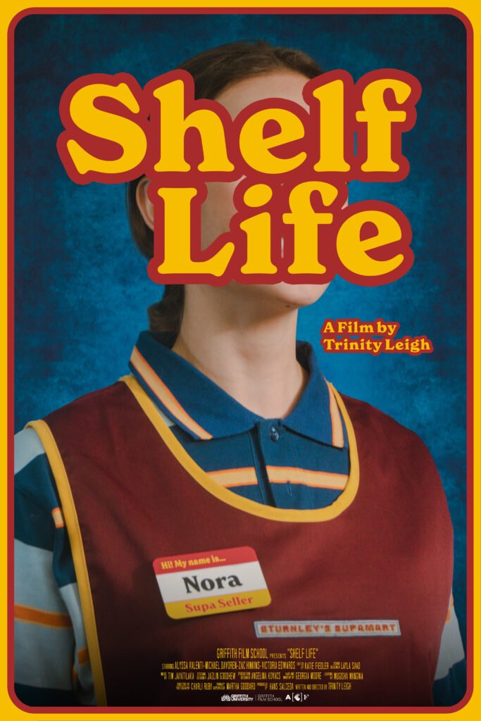
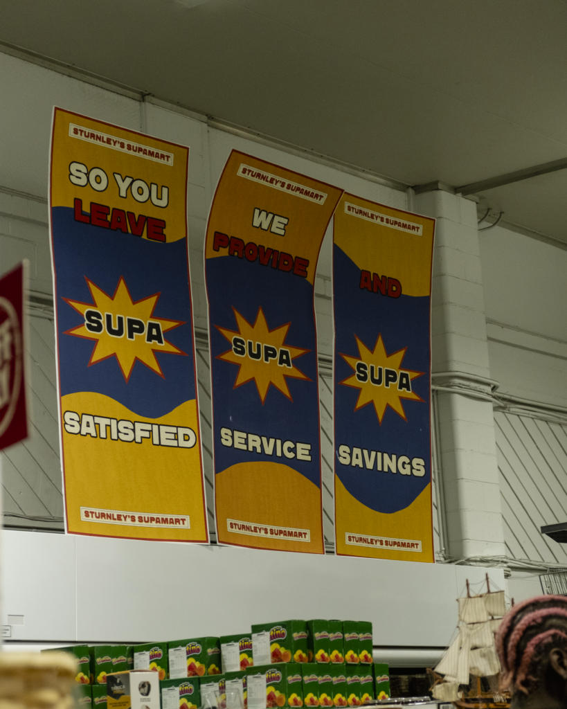
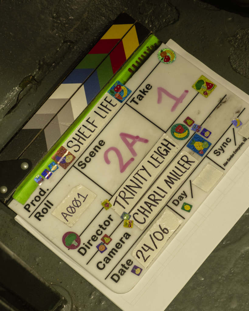
As time went on from Proof-of-concept to Principal to Pickups, the time period of Shelf Life became more ambiguous. To put it as simply as I can, it’s set in the early 2000s, but the store is stuck decades behind, having stylistic features from the 80s-90s, very run down and old.
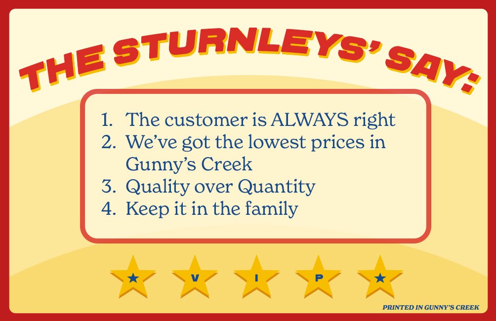
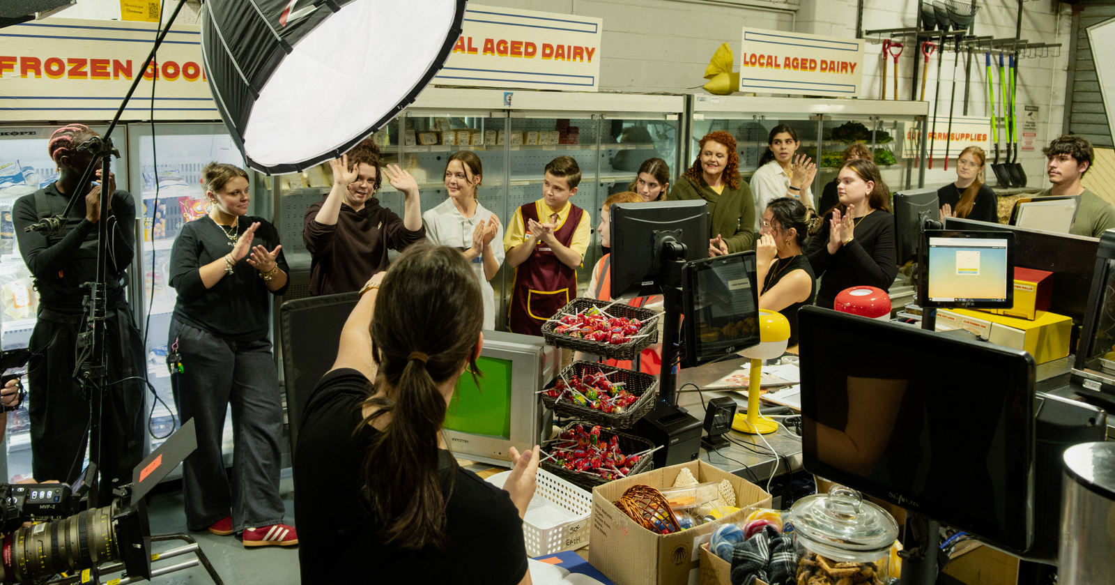
For my graphics and prints, colour references being bright primaries that were popular in the 80s. Many key characteristics of rural Australian grocery stores in the late 90s and early 2000s were that they were independently owned, and often the only one within their local community/town. Their products were limited and goods were specialised to the area and target demographics. Customers had a more personalized experience with their shop, often getting to know the family who owned the store, and their story. By the early 2000s, competition from big chains began to expand into regional areas, increasing the competition for these smaller, family run stores. Economic trends also impacted these family run businesses, as Australian manufacturing began to decline in the late 90s, many goods were cheaper to import, which resulted in the viability of local suppliers and store offerings to be impacted. It often costed far more to create a local product than it did to import.
Another element of my research also came from having conversations with my mother, who grew up in Toowoomba in the 80s. Her parents owned the corner grocery store on Campbell Street from before she was born, until after she moved down from the mountain. She was a checkout chick for most of her teenage years, and spent most afternoons after school working at the shop, and then studying at night. I tried to show her my graphics and tell her my ideas as much as possible so she could somewhat ‘fact check’ my work.
Locations and establishments used for stylistic references| Pre-2000s:
● Bi-los
● Franklins
● Milkbars
● Shoprites
● Sparmart
Stylistic references in Film:
● Titsiana Booberini | Robert Luketic (1997)
● The Castle | Rob Sitch (1997)
● Strictly Ballroom | Baz Luhrmann (1992)
● Muriel’s Wedding | P. J. Hogan (1994)